The Short Version
We didn’t redesign AdPlexity Social to make it look better.
We rebuilt it because the old workflow was slowing you down.
Too many clicks.
Too much clutter.
Too much context is lost between ads, domains, and pages.
If you’ve ever:
saved dozens of ads and couldn’t reconnect them to the funnel
lost track of which domains or pages actually mattered
or spent more time navigating than researching
You’ve felt it.
This update fixes that.
The new AdPlexity Social is faster to navigate, fully customizable to your workflow, and built to keep your research organized as it scales.
And more importantly, it changes how you actually work inside the tool.
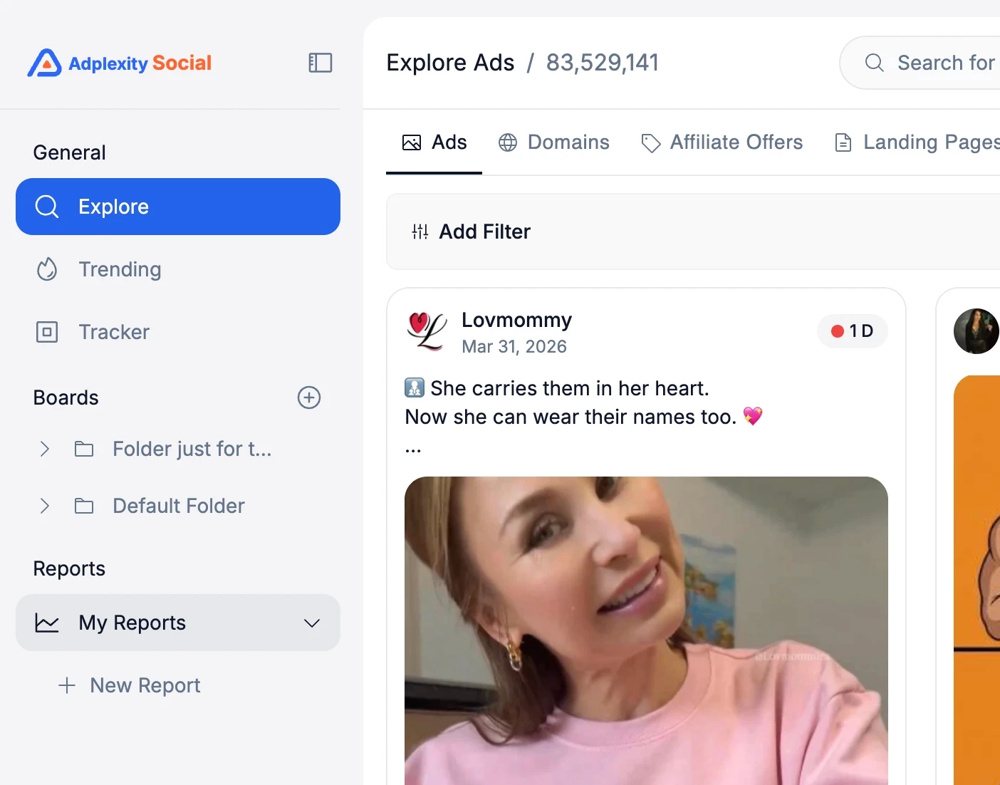
New Navigation: Explore, Trending, Tracker
The first thing you will notice is that the main navigation has moved to the left sidebar.
The core sections, Explore, Trending, and Tracker, remain the same. We only changed where they live.
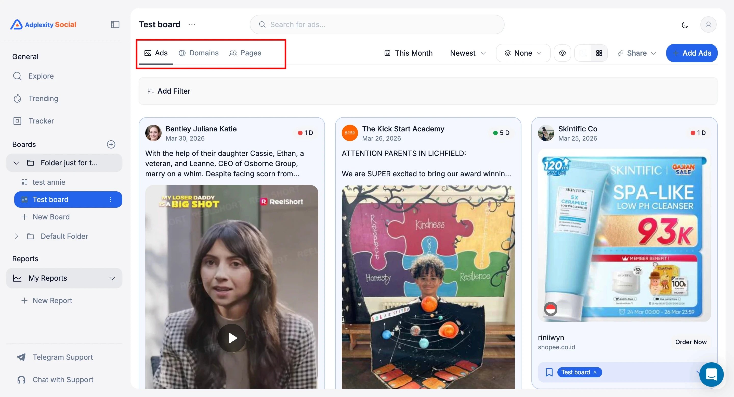
Inside Explore, though, there is a meaningful structural change. You now navigate between three dimensions from the top of the page: Ads, Domains, and Landing Pages.
This makes it much easier to switch between research modes without losing your place. And this dimension list will grow over time as we add more ways to slice the data.
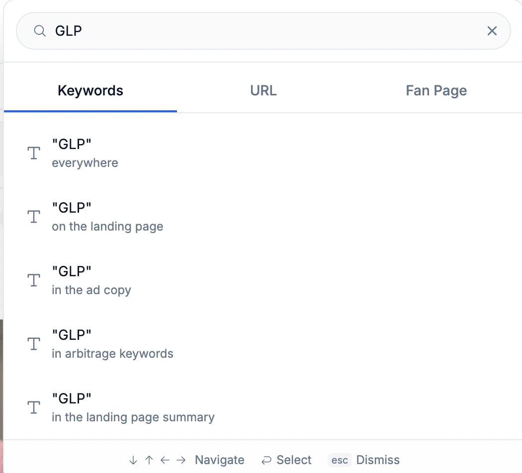
Search That Gets Out of Your Way
Search in V1 required you to choose your search type before you typed anything. Keywords, URLs, or fan pages.
You had to decide upfront.
That is gone. Now you type your query first, and then choose how you want to search.
It sounds like a small thing, but in practice, it removes a friction point that slowed down every single research session.
You search for "GLP" and then decide whether you want keyword results, URL matches, or fan page results. The platform adapts to you, not the other way around.
A Completely Rebuilt Filter Bar
This is probably the single biggest UX improvement in the new interface.
In V1, all filters were always visible.
That works well if you use all the filters we offer, but most people do not.
An ecommerce brand running Shopify ads does not need the affiliate network filter. Someone focused on lead gen in the US does not need the arbitrage network filter taking up space.
The new filter bar is triggered by clicking "Add Filter," which opens a panel where you can view and select from all available filters.
That alone is cleaner. But the real upgrade is customization.
You can now remove filters you never use, reorder the ones you keep, and save that layout as your default. Every time you log in, your filter bar is arranged exactly the way you set it up.
If you only care about vertical, country, and technology filters, strip everything else out.
Your interface becomes purpose-built for your specific workflow.
Boards: Where Research Finally Comes Together
This is the most important change in the new AdPlexity Social.
And it solves a problem most ad spy tools never addressed properly.
Until now, “saving” meant collecting ads.
But serious research is not just about ads.
It’s about:
the domains behind them
the pages running them
the full funnel connecting everything
In V1 and in most tools, that context gets lost.
You end up with:
scattered screenshots
disconnected notes
and no real way to see the full picture
Boards fix that.
What Boards Actually Do
A Board is not just a swipe file.
It’s a structured research workspace.
Inside a single Board, you can save:
ads
domains
Facebook pages and Instagram profiles
All in one place.
You organize Boards inside folders, however you want:
by vertical
by competitor
by client
by campaign type
Your research finally stays connected.
What This Looks Like in Practice
Let’s say you’re researching Medicare pay-per-call campaigns.
Instead of saving random ads, you build a complete view:
ads that are currently scaling
the domains they send traffic to
the pages running those campaigns
All inside one Board.
Now you’re not just collecting creatives.
You’re mapping the entire ecosystem.
Why This Actually Matters
This changes how you analyze competitors.
You stop looking at isolated ads
and start understanding systems.
You see:
which pages are driving volume
which domains are reused across campaigns
which creatives connect to which funnels
That’s where the real edge comes from.
Built for Teams, Not Just Individuals
Boards are also shareable.
You can generate a link and send it to:
And you control what they see:
full board
just ads
just domains
just pages
No exporting. No screenshots. No messy handoffs.
Just clean, structured research.
Most tools help you find ads.
Boards help you understand what’s behind them.
And right now, no other ad intelligence platform brings ads, domains, and pages together in a single workflow like this.
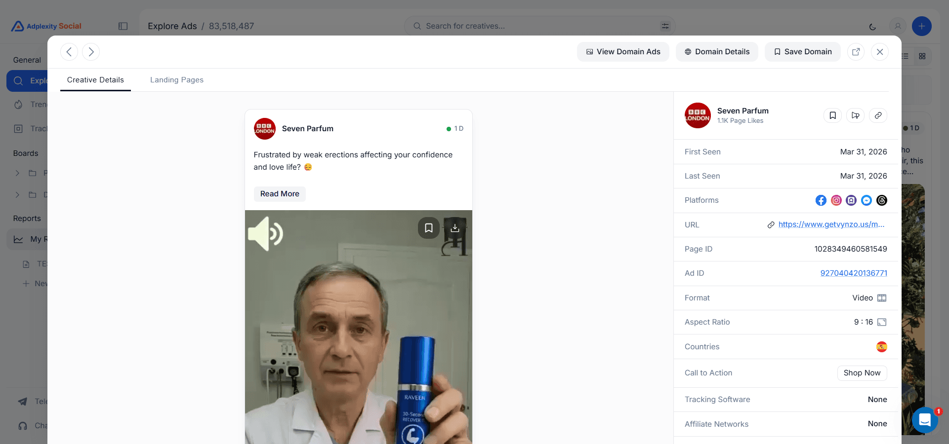
Ad Details: Reorganized for Faster Analysis
The ad detail view also received a structural overhaul.
Landing pages now live in their own tab instead of being stacked below the ad creative. This makes it much easier to toggle between the ad itself and its destination without scrolling.
From the detail view, you can quickly jump to domain ads, open full domain details in a modal, and navigate through all the analytics tied to that advertiser.
Active ad counts, percentage of total platform ads, landing page data, redirect chains, associated Facebook pages, geo and vertical breakdowns, creative performance, and ad copy analysis are all accessible from this single view.
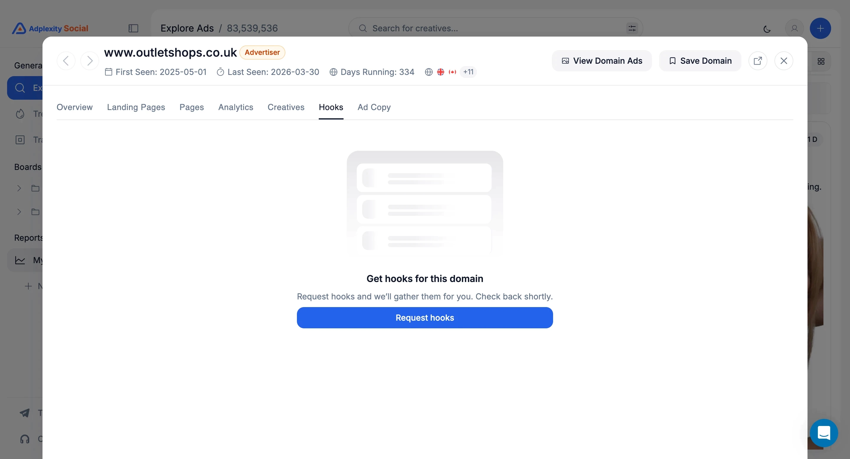
Video Hook Extraction
A new addition that was not available in V1: you can now request hook extraction on video ads directly from the ad detail view.
Click "Request Hooks," and the platform processes the opening hooks from video creatives, so you can analyze what is working at the very top of the funnel without having to watch every video manually.
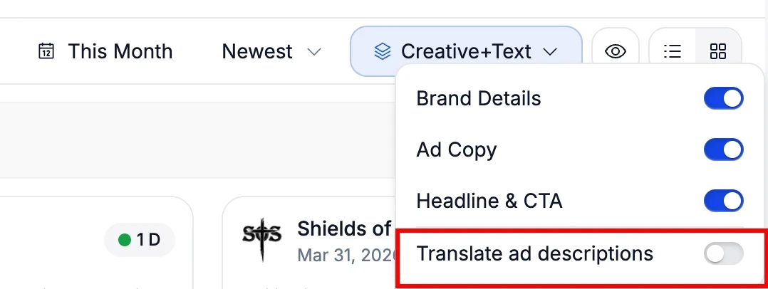
Instant Ad Copy Translation
If you research ads across multiple markets, this one matters. A new translation toggle in the results view instantly converts all ad copy from any language to English.
No more copying text into Google Translate. No more guessing what a German or Portuguese ad is actually saying. Toggle it on, and every ad in your results displays its copy in English.
For anyone running campaigns across the 14 countries AdPlexity Social covers, this turns international competitive research from a chore into something you can do as fast as domestic research.
Domain Details: Cleaner, Same Depth
The domain detail view has been redesigned for readability. All the same data is there, including active ad counts, landing page breakdowns, redirect chains, associated fan pages, geo and vertical analytics, creative performance, and ad copy analysis with sortable KPIs. We just made it easier to read and navigate.
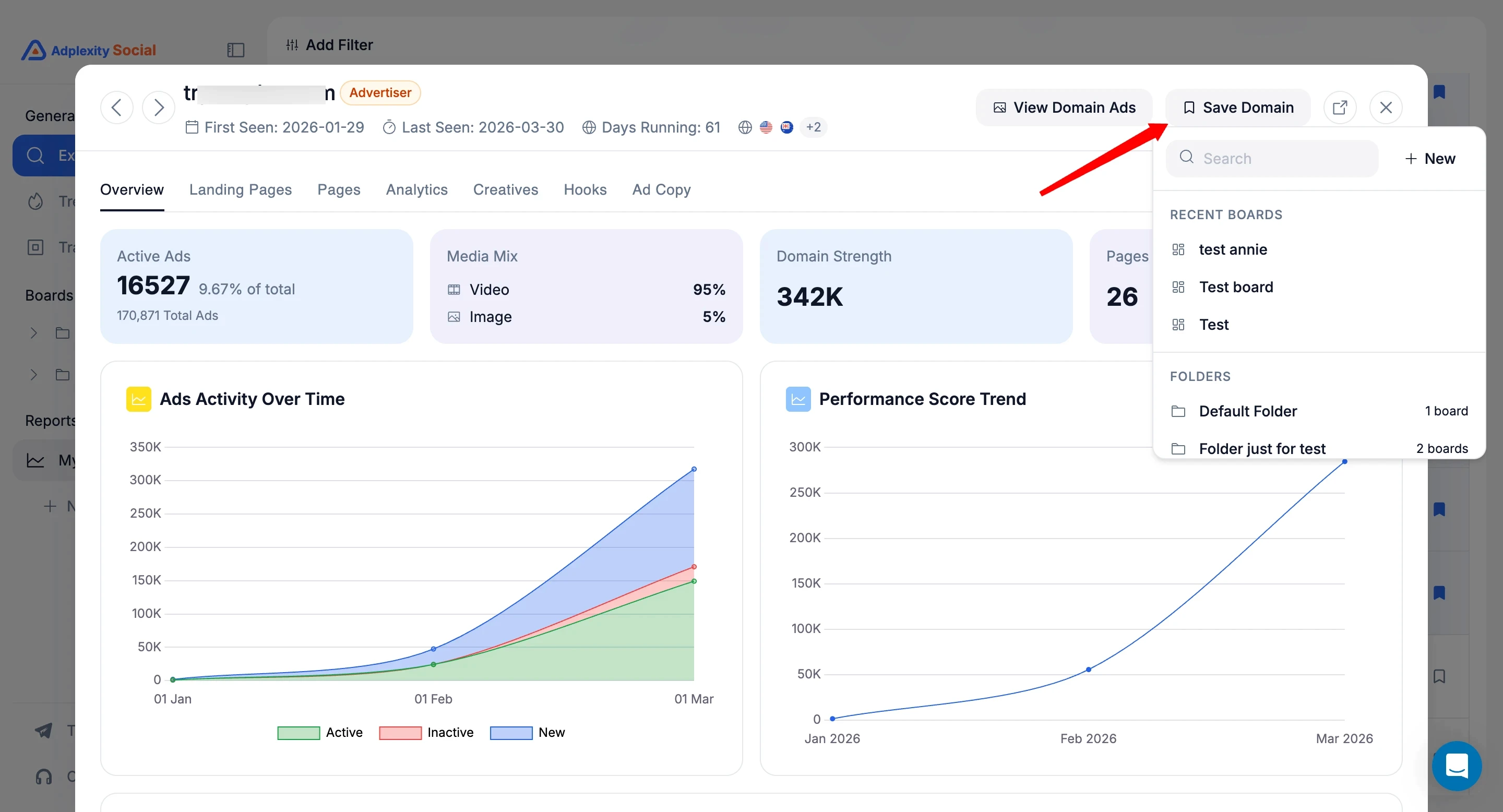
You can also save domains directly to Boards from this view. If a domain is already saved, it shows a highlight indicator so you always know which domains are already in your research collection.
What Is Coming Next
This isn’t a small update.
It’s a faster, more organized way to research, analyze, and understand campaigns inside AdPlexity Social.
Less time navigating.
More time finding what actually works.
If you’re already using AdPlexity Social, you’ll feel the difference immediately.
If you’re not, this is the version worth starting with.
Try It Yourself
The new AdPlexity Social interface rolls out this week. If you are already a subscriber, you will see it automatically.
If you have been considering trying AdPlexity Social, this is a good time.